How to Color Grade In Premiere Pro
Color is not only a fundamental part of how we see the world but how we see film and video as well. Different colors can convey a certain feeling or can draw the audience’s attention to a specific point on the screen.
The introduction of NLEs has helped to simplify video editing techniques that were once incredibly complicated. Color used to be based entirely on the lighting and film stock during production. Now, color correction and color grading can be done entirely within your video editing software of choice.
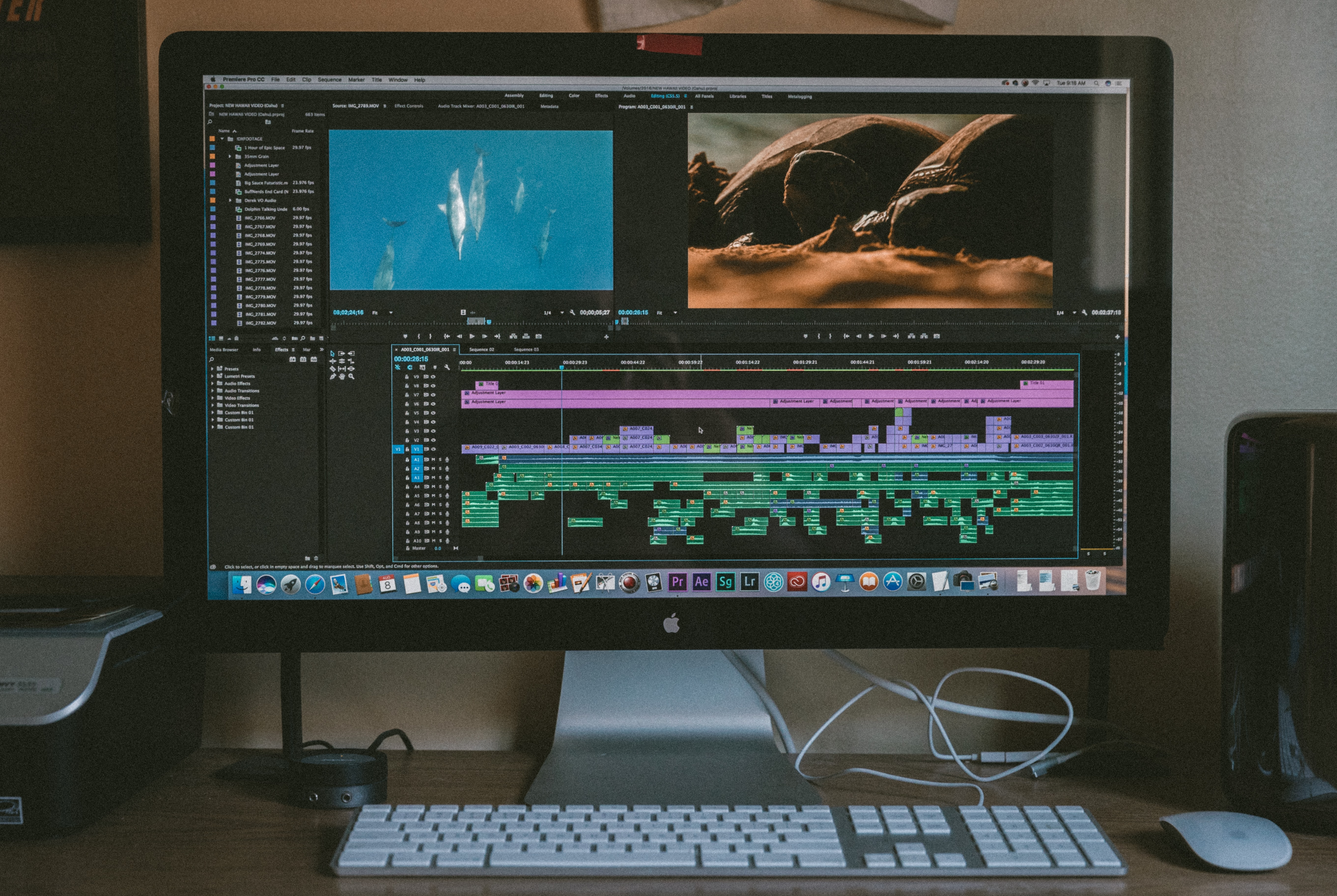
While programs such as Final Cut Pro and DaVinci Resolve offer incredible color grading options, no program is quite as popular as Adobe Premiere Pro CC.
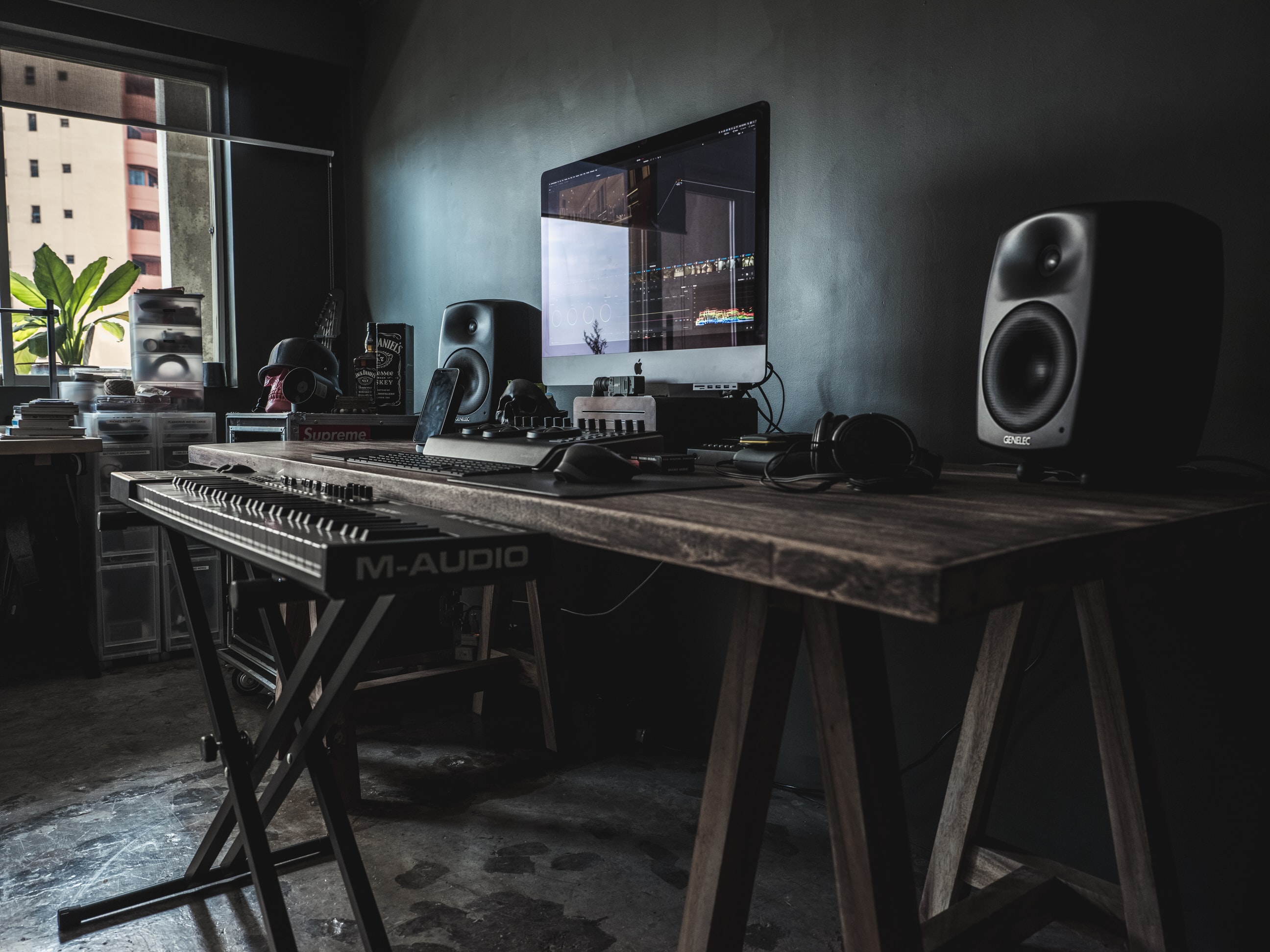
Adobe Premiere Pro offers a wonderful array of features for colorists and dynamic syncing with the Adobe Creative Cloud suite of products such as After Effects and Photoshop. This post will go over coloring for video production in Adobe Premiere Pro for Mac and Windows devices, perfect for those looking to up their coloring workflow.
Note: With Simon Says, you can easily create captions and subtitles that perfectly complement how you color your videos. The software works natively in Premiere Pro and you can use it with just a few clicks.
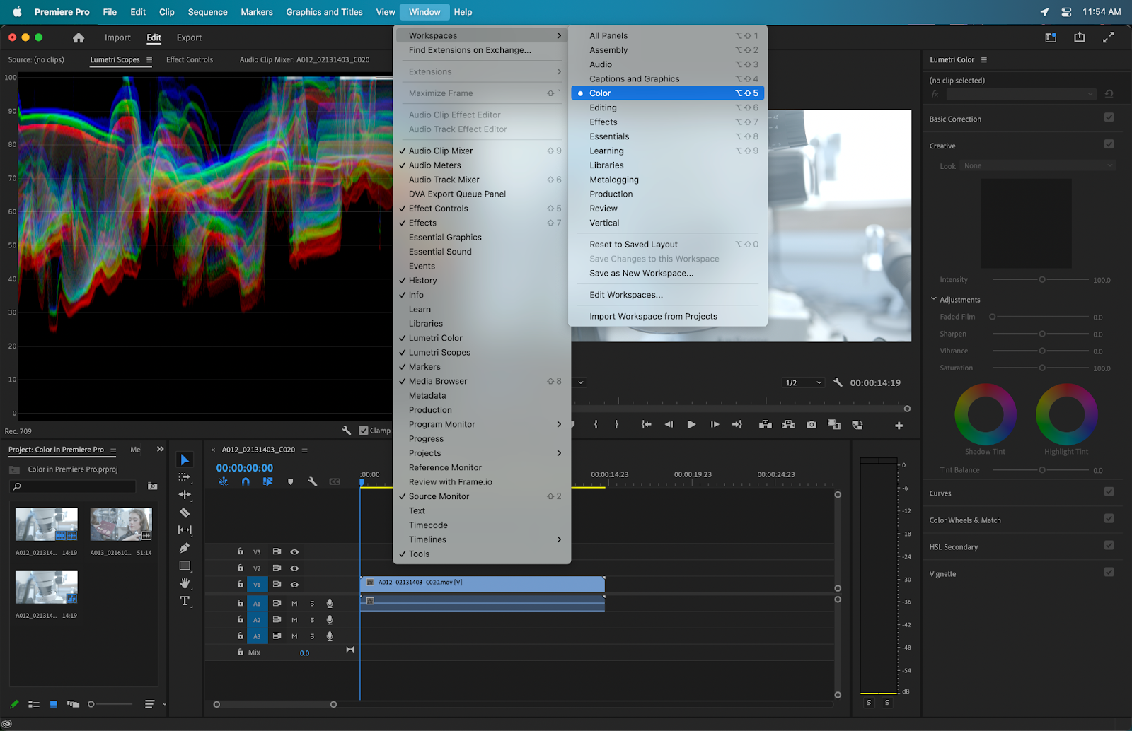
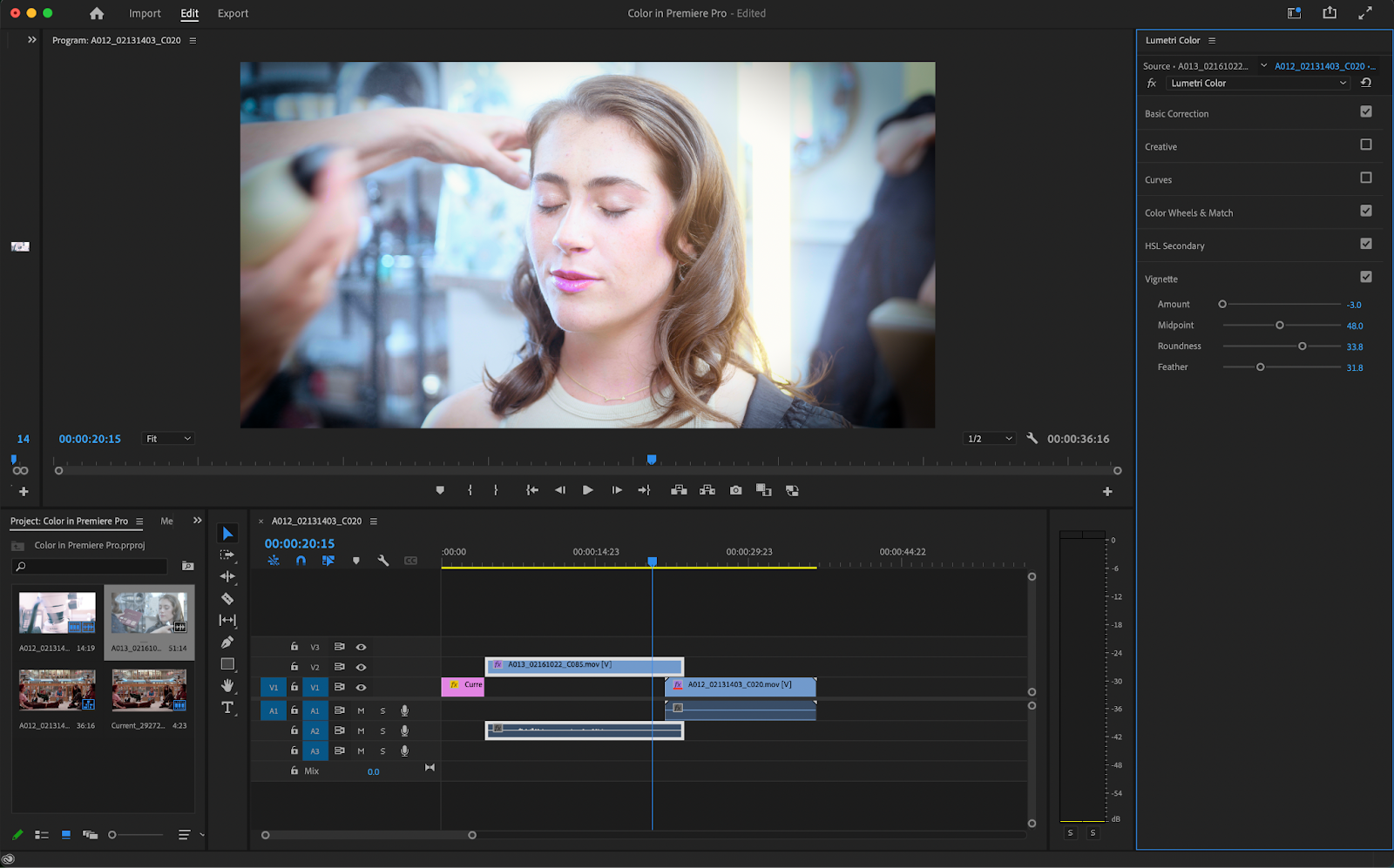
The Lumetri Color Panel
The Lumetri Color Panel in Premiere Pro is where you’ll find all of your color grading tools. Premiere Pro is broken up into a few different workspaces. These workspaces can be accessed by going to Window > Workspaces.
This will bring up a drop-down menu containing a slew of customizable workspaces like Audio, Editing, Motion Graphics, and Color. Clicking on Color will provide you with all the tools you need to begin coloring your clip.
The Lumetri Color Panel is located on the right-hand side of the screen and contains a few different submenus.
Basic Correction
The Basic Correction window has a few very simple color effects and is a great starting point for coloring your clip.
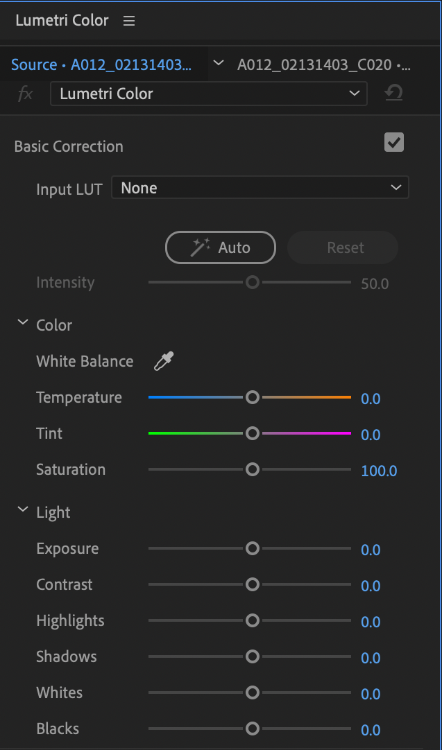
- Input Lut: The input Lut gives you a few different LUT templates to choose from. An input LUT enhances your footage and is incredibly useful if you’re shooting in a LOG (or flat) color profile.
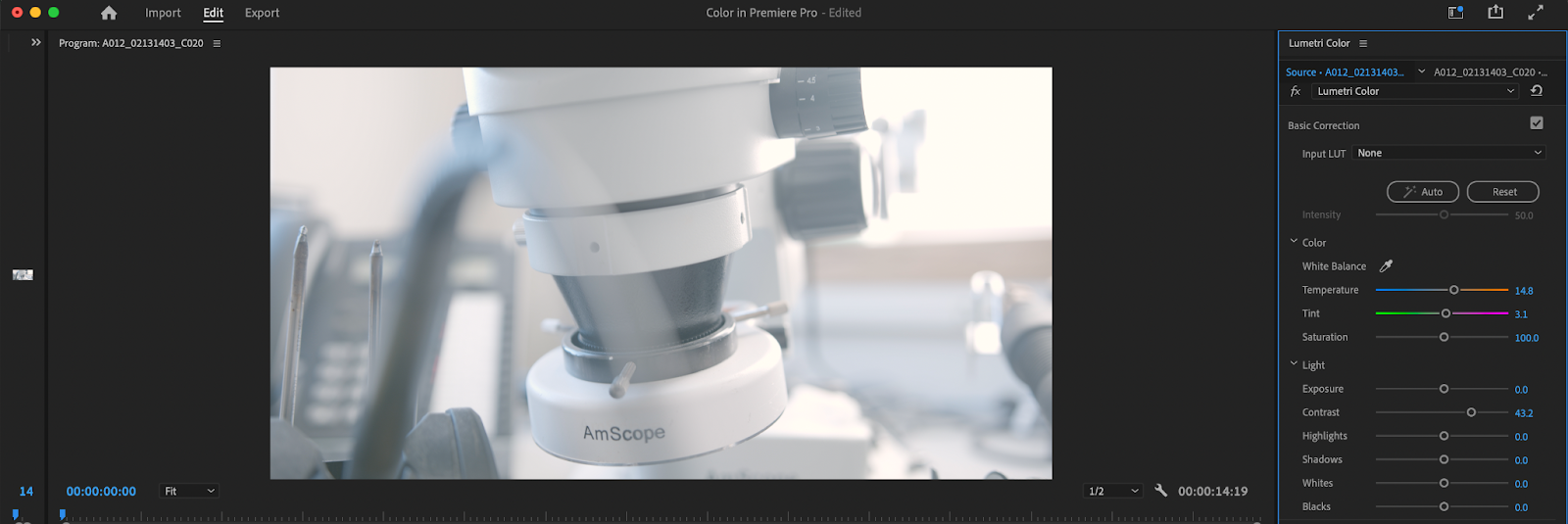
- White Balance: The White Balance gets rid of any weird color casting that may be present in your footage and helps render white as being - well - white. Ever see footage that has a super orange or blue tint to it? This is probably due to the white balance being incorrect. Both temperature and tint will help fix this issue.
- Saturation: The saturation of your image is how vibrant the colors are. An image with no saturation will appear black and white whereas an image with incredibly high saturation will have colors that pop.
- Exposure: Exposure is simply how much light your image has in it. A video with low exposure will look incredibly dark and muddy whereas a video with high exposure will be bright
- Contrast: What contrast does is increase the distinction between lighter and darker areas of your image.
- Highlights: This slider changes how bright and contrasty the bright areas of your image are.
- Shadows: This slider adjusts how bright and contrasty the dark areas of your image are.
- Whites: What this slider does is adjust how bright and contrasty the white areas of your image are (usually the same as your highlights but now always).
- Blacks: This slider adjusts how bright and contrasty the black areas of your image are (usually the same as your shadows but not always).
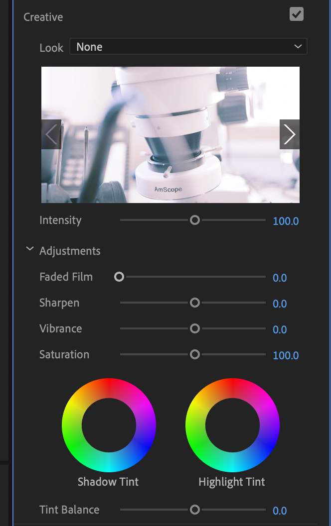
Creative
Underneath the Basic Correction tab is the Creative Window. The Creative Window gives users a few more options that add a bit more flare to their videos.
- LUT: The Creative Lut (or look-up table) gives the picture a much more unique flare. Premiere Pro has a myriad of presets, but there are also plenty of plugins available online for you to play with if you so desire. A LUT gives a certain look or feel and is often synonymous with color grading as opposed to color correction. This is what can give a “cinematic look” to your footage.
- Faded Film: The faded film slider gives a much softer image and washes out the highlights as well as the shadows. This is great for filmmakers who are trying to fake some sort of a film look.
- Sharpen: This slider is pretty self-explanatory. Sharpen simply enhances any softer pixels to create a crisper image. Sliding this down will make for a softer image though.
- Vibrance: Vibrance enhances colors in the image that are dull.
- Saturation: Saturation further enhances and intensifies every color in your image.
- Shadow Tint: The shadow tint is a color wheel that shifts the color of the shadows depending on where you put it.
- Highlight Tint: The highlight tint is a color wheel that shifts the color of the highlights depending on where you put it.
Curves
After Creative is the Curves Window. Curves give you much more control over a lot of the features covered under Creative and Basic. For example, the RGB Curve is used to adjust the contrast of your image. A simple “S curve” will boost the highlights and darken the shadows. You can create a curve by clicking on the line in the middle of the color graph. A dot will form that you can drag around. Double-clicking this dot will reset everything back to normal.
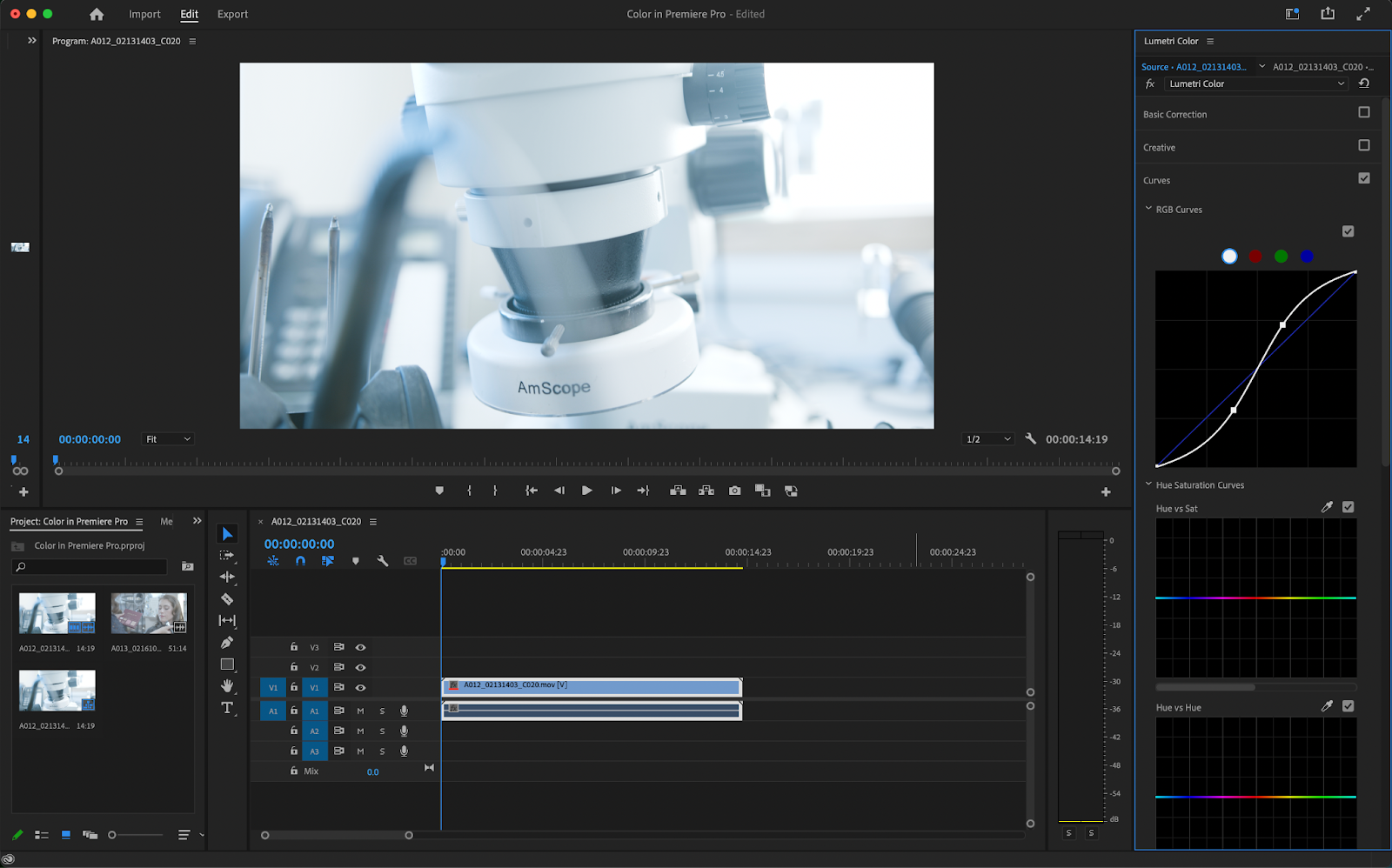
You can adjust the red, blue, and green levels on the graph by selecting the respective color at the top of the screen. Using the graph in this mode will accentuate the color values. If you’d like, you can white-balance your image by just using this method.

- Hue vs Sat: This isolates a particular color range and allows for it to be more or less intense.
- Hue vs Hue: What this does is allows you to select a certain color and change it to another color. This is super handy for stylistic content (such as music videos or social media clips).
- Hue vs Luma: This will change the brightness of certain areas depending on the range that you choose.
- Luma vs Sat: What this curve does is let you change the brightness of a spot based on the saturation.
- Sat vs Sat: This changes the saturation of certain colors of the image which can be incredibly handy if a background color is too prominent or not prominent enough.

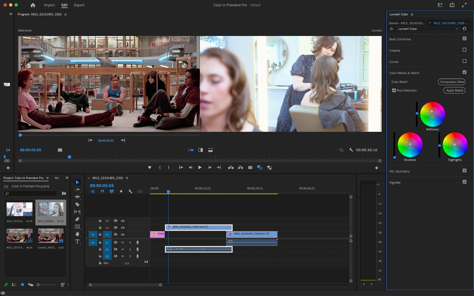
Color Wheels & Match
Color Wheels are another way to color your image. They’re very similar to curves but in wheel form. The Highlight Curve adjusts the intensity of your highlights, the Shadow Curve will adjust the intensity of your shadows, and the Midtone curve will adjust the intensity of your mid-tones (which is pretty much everything in between your highlights and shadows).
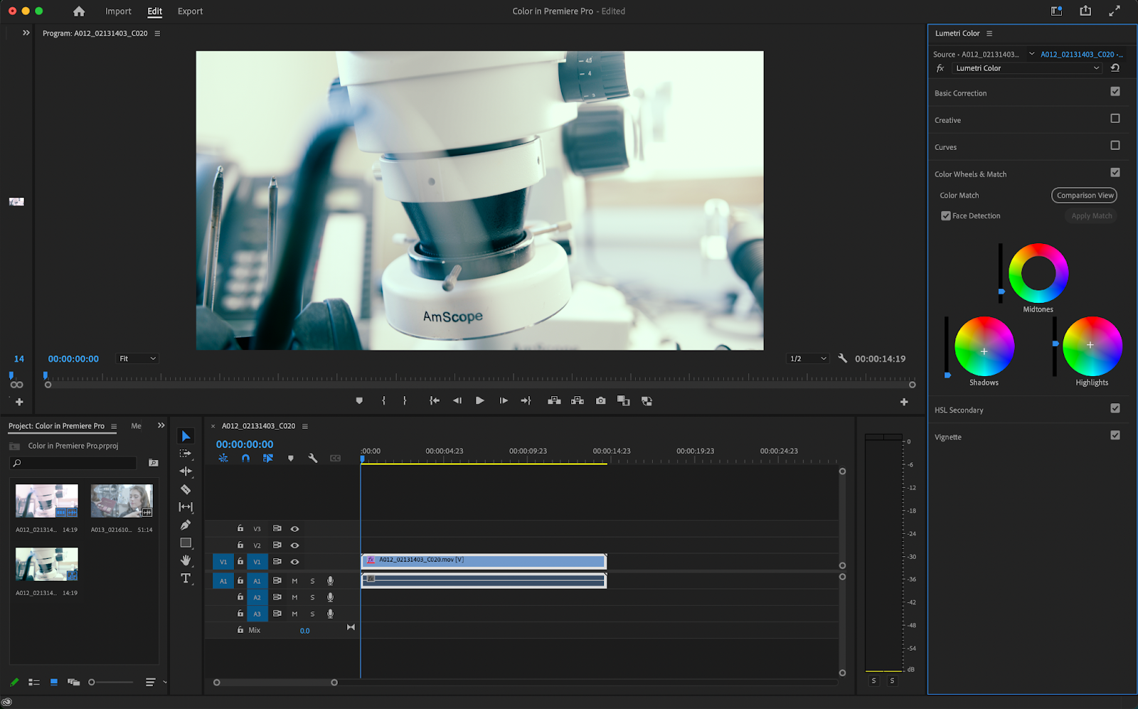
The color match feature found in this window will automatically color your image based on a reference image that you feed it.
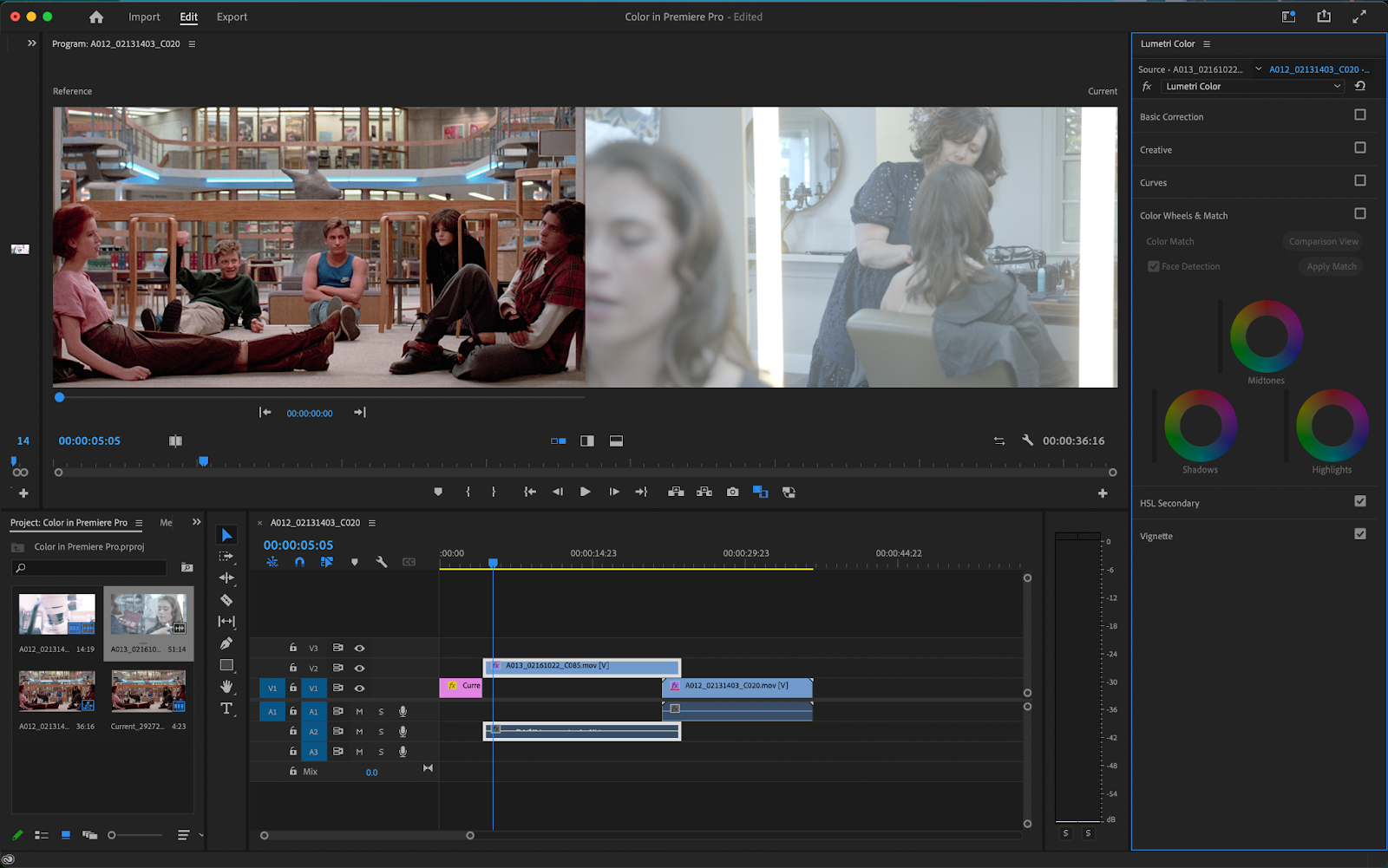
Simply put an image or video clip next to the clip you wish to color and click Comparison view. Then, click on Apply Match and Adobe Premiere Pro will create a look for your image similar to the one that you gave it.
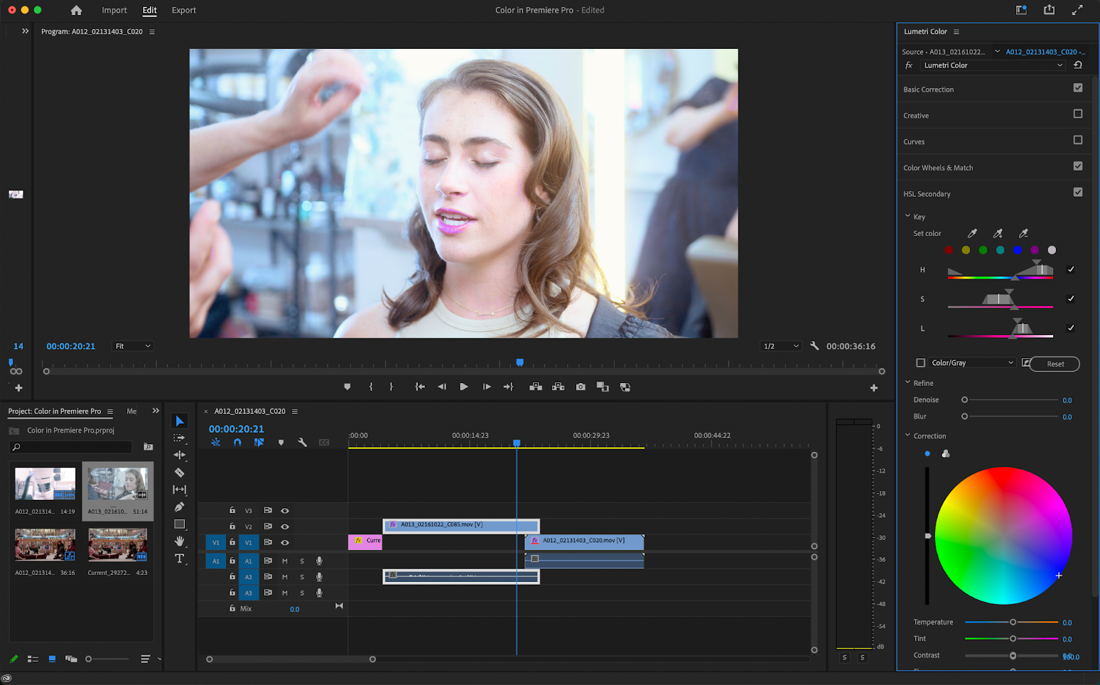
HSL Secondaries
The HSL secondaries panel is a culmination of everything looked at so far. You can select specific colors in your image using the eye dropper tool and edit or enhance those specific colors using the color wheel located at the bottom.
Vignette
Finally, there’s the Vignette window which lets you add a Vignette to your image. All a Vignette does is add a soft black or white circle around your image. This can be done either as a cool stylistic choice or as a way to focus in on a subject.
The Lumetri Scopes panel
The Lumetri Scopes panel is located on the left-hand side of Premiere and can be used as a reference to see how over or underexposed your image is as well. There are so many reasons to be using scopes while coloring.
Our eyes can only do so much and are far from accurate when viewing colors. Your monitor also may not be entirely accurate, requiring you to rely on scopes for complete color accuracy. Right-clicking on the Scopes panel will let you display a few different kinds.
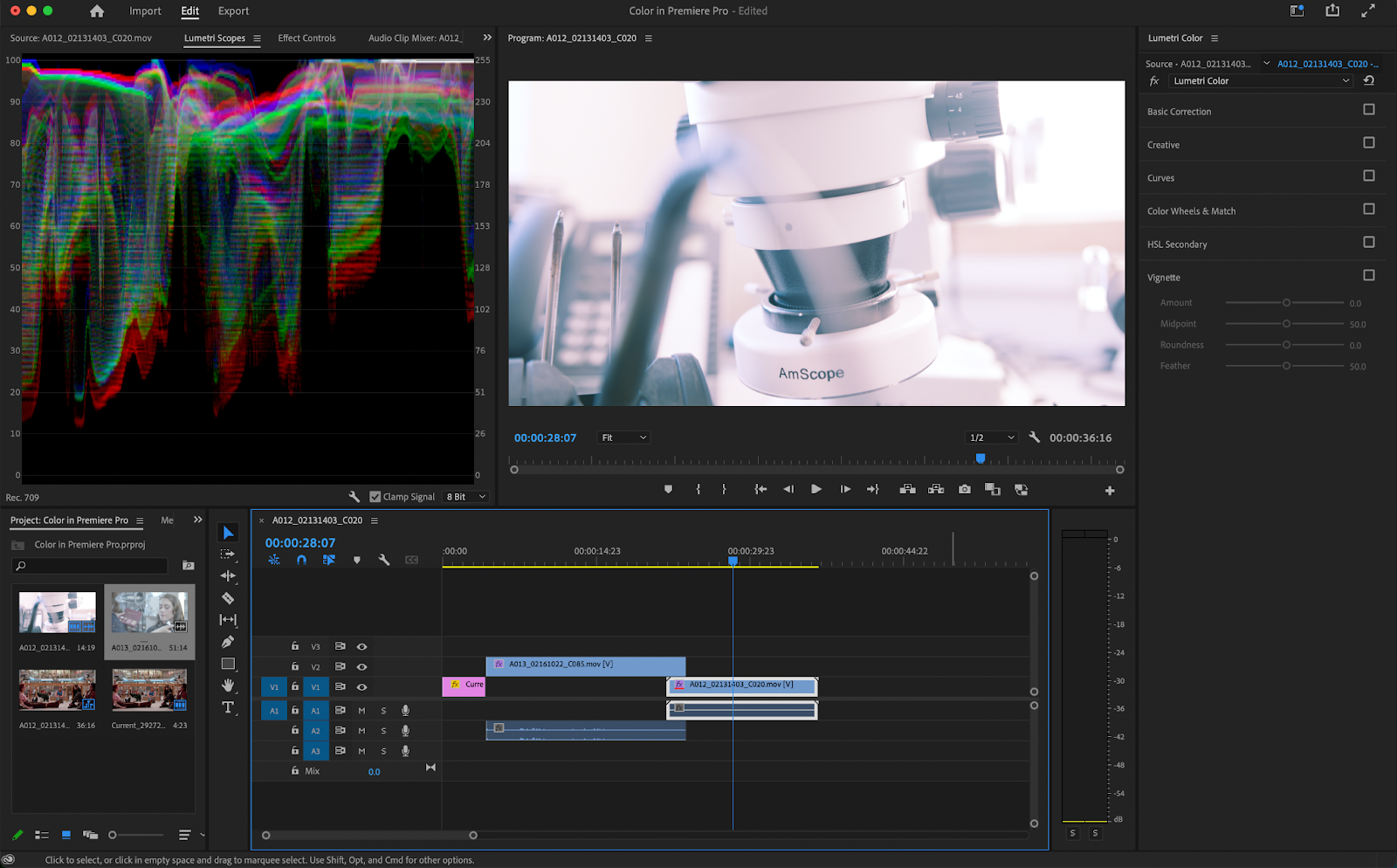
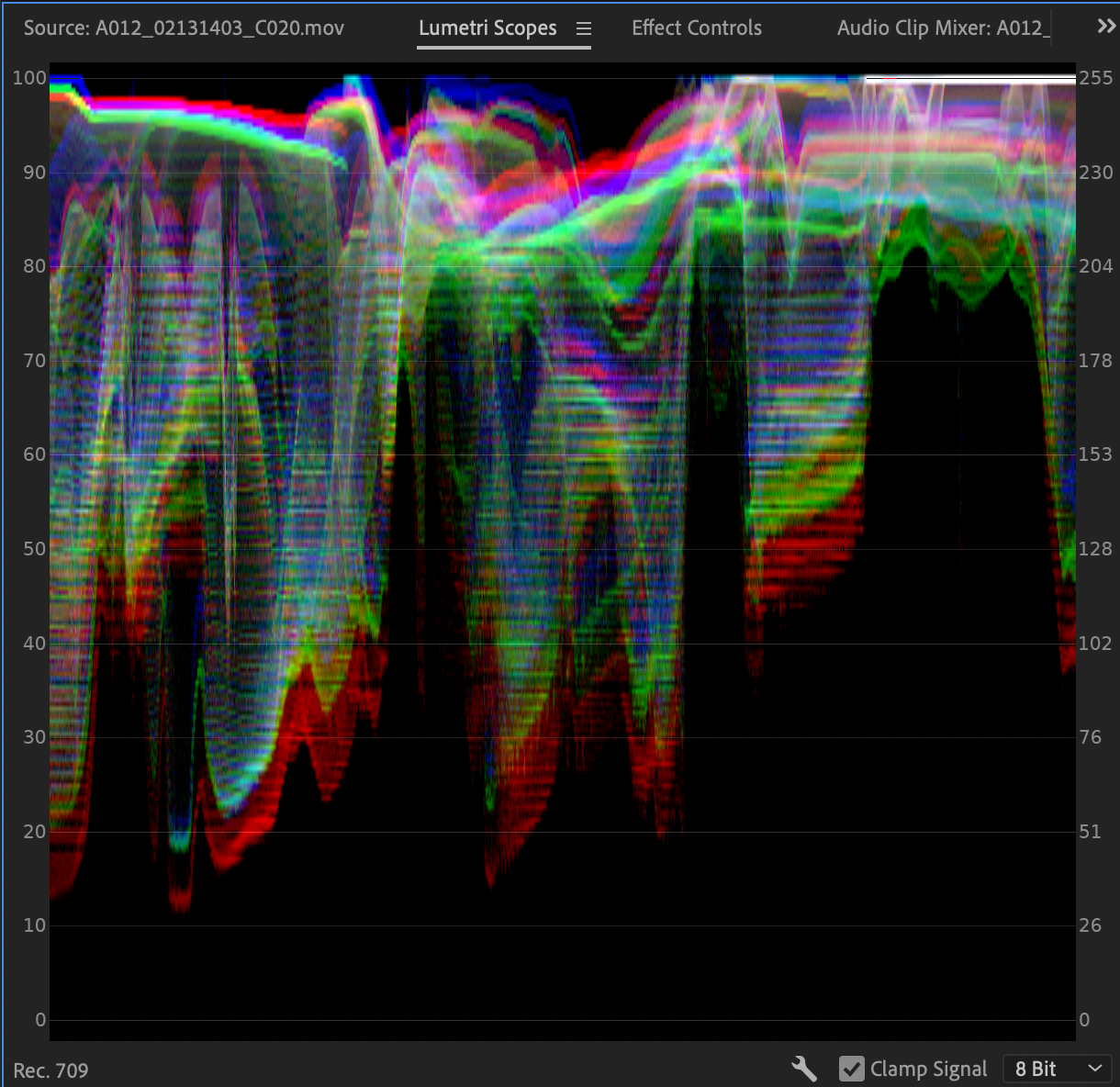
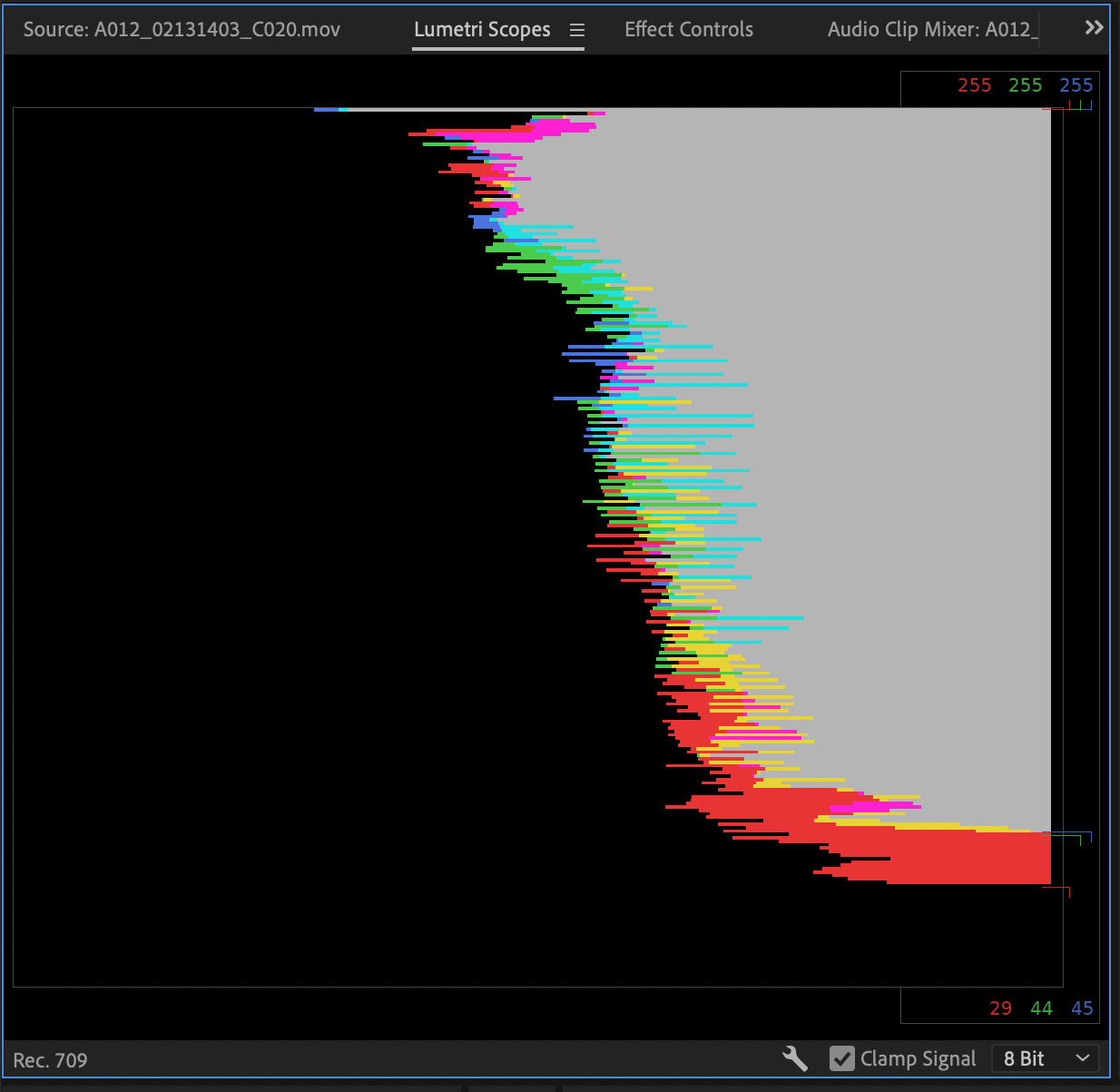
Waveform Monitor
The Waveform scope is the default scope and asses the brightness of your image as well as specific colors using an IRE scale that ranges from 0-100.
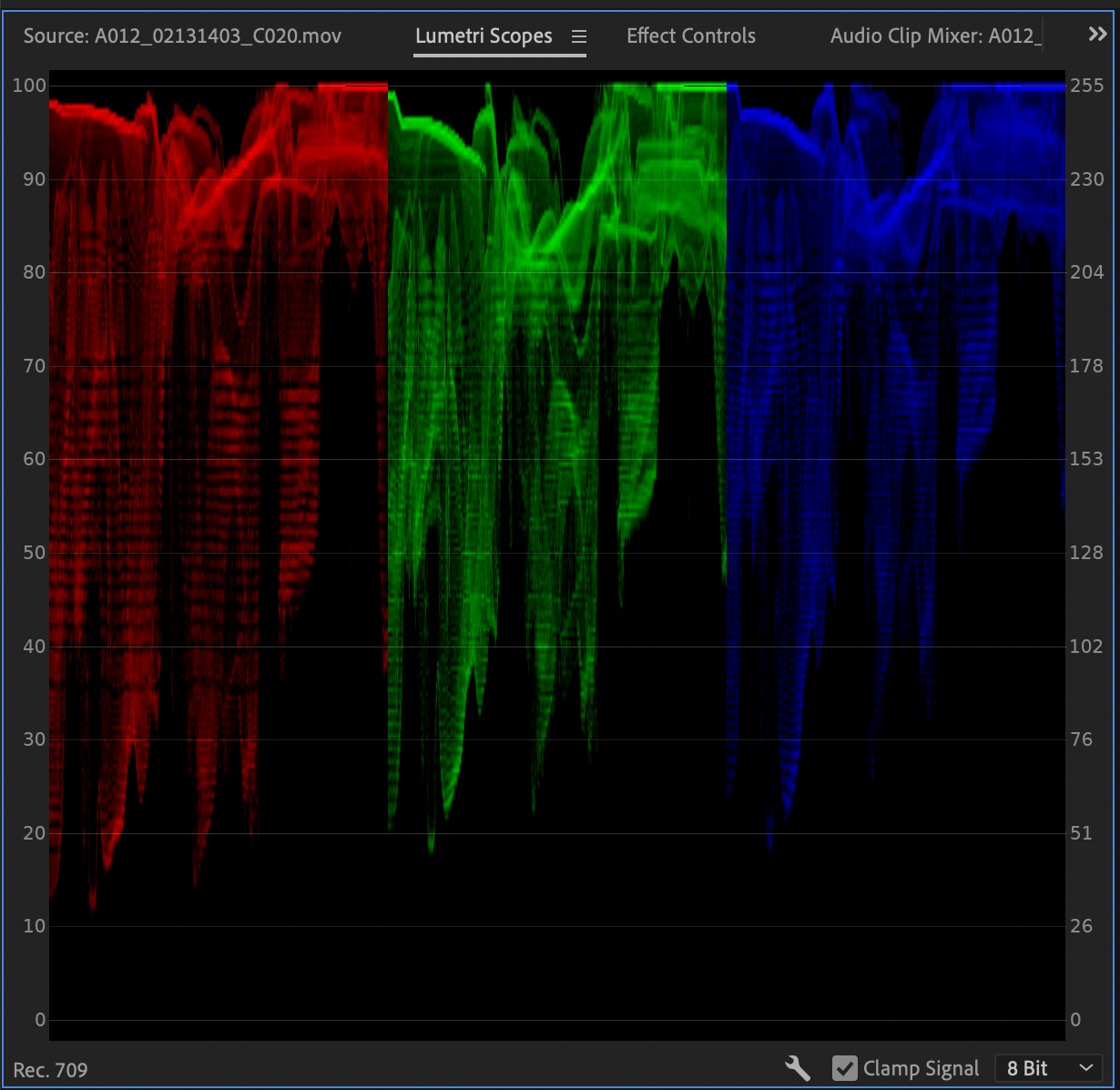
Parade
The parade splits your image up into RGB values. What the parade does is measure the saturation of each of these colors in your image.
Vectorscope
A vectorscope is incredibly handy for measuring the degree of hue and saturation in an image. The further the markings are from the center, the more saturated your image and colors are. There’s also a line indicating where your skin tones should be. Skin tones can often shift green or blue depending on your camera, so it’s good to have this indicator to make changes in post production.

Histogram
A histogram is a graph that measures the brightness of an image by representing the frequency of each tone as a value on a bar chart. Your histogram running off towards either hand indicates that either your highlights or shadows are being clipped. A histogram is most important when filming and is a great tool to have while on set.
Color grading workflow in Premiere
It’s always best to start out with a simple color correction while working. Color correction fixes any imbalances you may have had while shooting. Things like white balance, highlights, and shadows all fall under color correction.
Color grading on the other hand is the more creative side of coloring. Things like saturation, LUTs, and HSL secondary all fall underneath color grading. It’s best to perfect your coloring correction first before moving on to color grading.
Typically, it’s also best to do all of your coloring on an adjustment layer as well. Adjustment layers can be created by going to the bin at the bottom left of your screen, right-clicking and going to New > Item > Adjustment layer.
Throw this on top of your footage in the timeline and make color changes to the adjustment layer. This will, in turn, also make color changes to whatever is underneath it. This way, your original footage stays intact.
It’s also incredibly important to use scopes while coloring. As stated before, our eyes and even computer monitors are incredibly inaccurate. Utilizing scopes ensures that your image looks consistent across a wide range of devices.
Summary
Programs such as Premiere Pro, After Effects, and Photoshop have made Adobe a force in the creative field. With its strong color features, it’s not at all hard to see why Adobe Premiere Pro has been a mainstay in the film industry.
Color isn’t all that makes a great video, as extras like captions and subtitles can help make your content more accessible and engaging. With Simon Says, you can effortlessly caption and transcribe your content natively within Premiere Pro. Check out the extension and see how it can improve your video editing workflow.